New visual identity
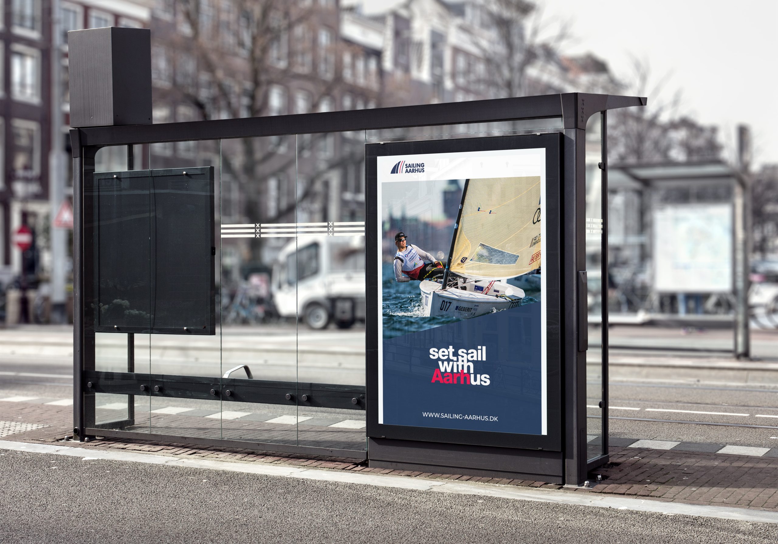
In the ever-evolving landscape of design, it’s essential for brands to stay current and relevant. Sailing Aarhus understood the importance of this and approached me with a clear goal in mind: to transform their outdated visual identity into a modern, dynamic, and memorable brand presence.
Challenges
Solution
Sailing Aarhus existing visual identity felt stagnant, failing to reflect the company’s innovative spirit and cutting-edge services. The challenge was clear—breathe new life into their brand while preserving its core values and heritage.
1. Reimagining the Logo: I started by creating a fresh and distinctive logo that would serve as the anchor of the brand’s new identity. The new design incorporated elements that paid homage to the company’s history while introducing a contemporary and timeless aesthetic.
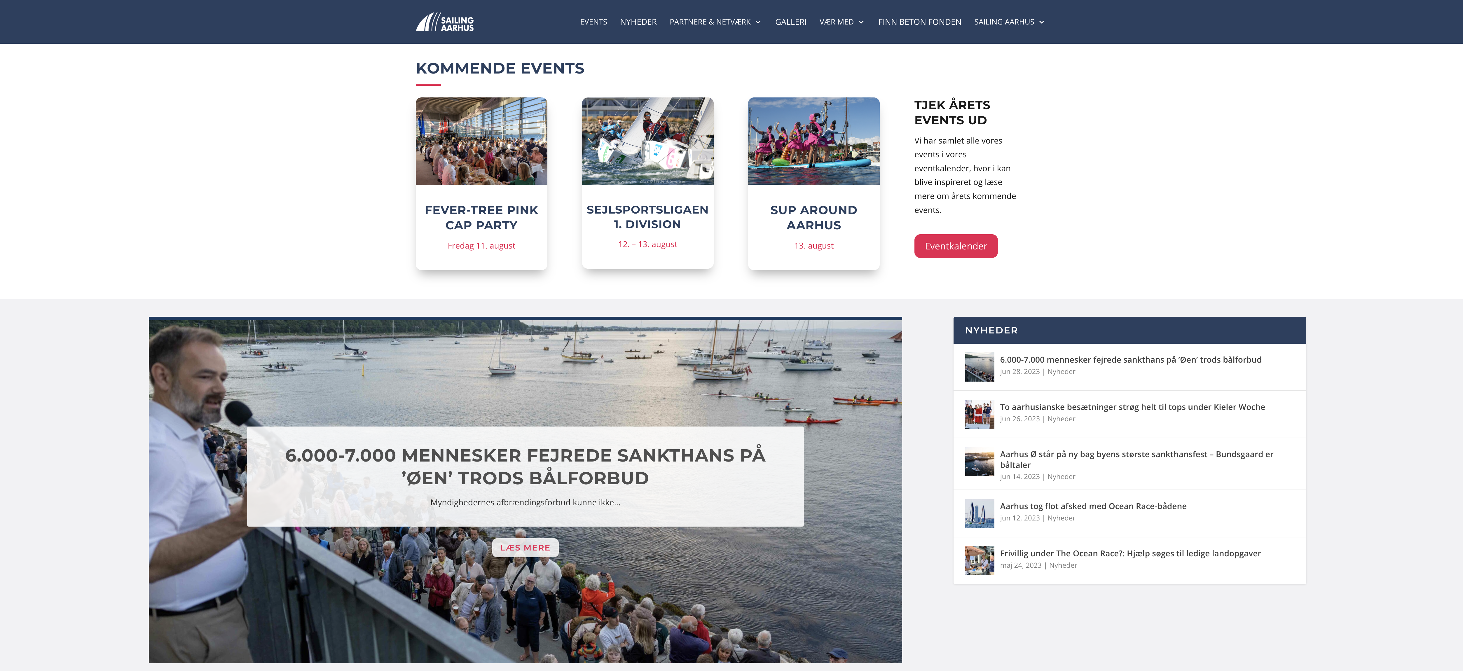
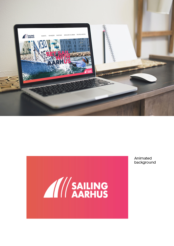
2. Revamping the Website: A sleek, user-friendly website was essential to make a strong online impression. I designed a modern website that not only showcased Sailing Aarhus services but also became a preferred newsfeed among their target group.
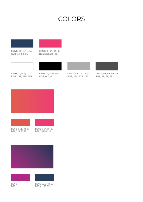
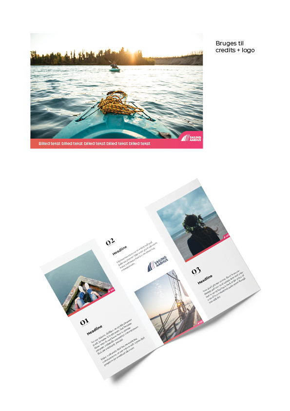
3. Selecting a New Palette and typeface: To ensure consistency across all touchpoints, I carefully selected a new color palette that resonated with the target audience and conveyed the brand’s values. The colors were chosen to reflect innovation, trustworthiness, and approachability.
Results
The transformation of Sailing Aarhus visual identity was a fun task. Their brand now exudes modernity and innovation, capturing the essence of their products and services. The refreshed identity has not only elevated awareness of the company but has also led to a substantial surge in website traffic.
Logo design
Logo challenges and re-design
The process of re-designing the logo for Sailing Aarhus was an exciting journey that required a delicate balance between preserving the brand’s heritage and addressing the challenge of the old logo’s visibility issues. My primary goal was to create a more modern, clean, and accessible design while retaining certain elements that symbolize the five sail clubs that Sailing Aarhus proudly represents.
Logo animation
When it came to launching Sailing Aarhus’ fresh logo, I made a small animation. Facebook, being the primary platform for Sailing Aarhus target audience at the time, became the canvas for the reveal.
The release was strategically timed to maximize visibility, ensuring that the target audience was front and center when Sailing Aarhus’ new identity made its debut.
Before the new logo was revealed posts on Facebook were made with teasers to create curiosity.
Website design
When embarking on the redesign of Sailing Aarhus’ website, the mission was clear: to transform a cluttered and outdated digital space into a navigable, engaging, and informative hub for the sailing community. The vision was guided by a thoughtful approach that sought to align the website with the evolving needs and interests of users.
Introducing a Newsfeed and Blog: To foster a sense of community and keep sailing enthusiasts engaged, I made a dynamic newsfeed and blog section. Here, visitors can stay updated on the latest sail sport developments, events, and stories from the sailing community. It not only keeps the website fresh but also positions Sailing Aarhus as a go-to source for sailing enthusiasts.
Ease of Navigation: I implemented a user-friendly interface that presents information logically and intuitively. From finding details about upcoming events to exploring resources for beginners, users can now effortlessly access the content that matters most to them.
Mobile Responsiveness: In an era where mobile devices dominate web browsing, it was important that the website was fully responsive. Whether users access it from a desktop computer, tablet, or smartphone, the experience remains consistent and enjoyable.
Typeface and color palette
In the redesign of Sailing Aarhus’ visual identity, the selection of typefaces and colors played a pivotal role in conveying the brand’s essence and values. Here’s the story behind the design choices:
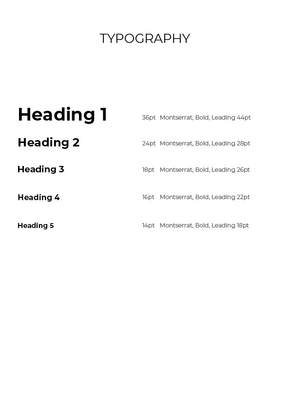
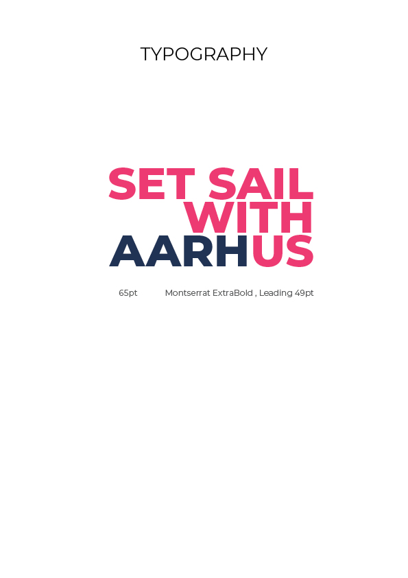
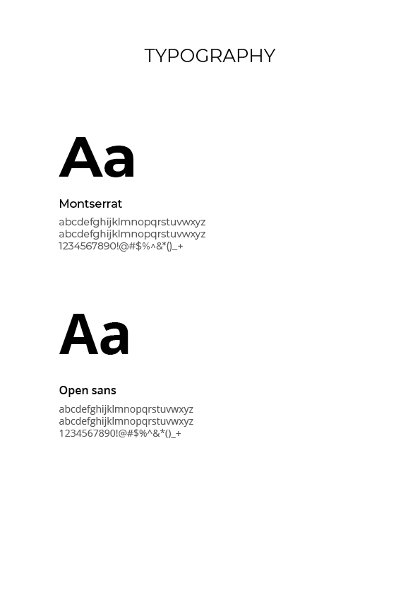
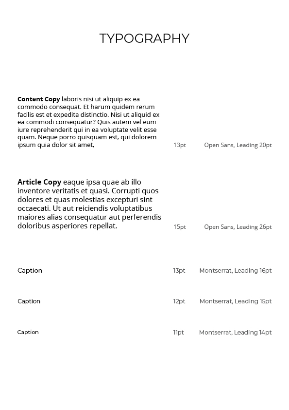
Typeface Harmony: Montserrat and Open Sans I chose a combination of two typefaces: Montserrat and Open Sans. Montserrat’s clean lines and modern geometric shapes reflect the precision and sophistication that define sail sport. It exudes a sense of professionalism and clarity, making it an excellent choice for headings and titles. Open Sans, on the other hand, offers readability and accessibility, ensuring that the website’s content is both approachable and easy to digest. This harmonious pairing allows for a balance between aesthetics and functionality, aligning perfectly with the website’s user-centered design.
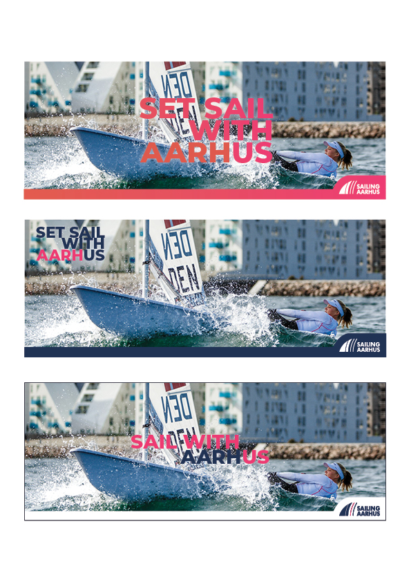
Blue – The Essence of Sailing: Blue was a natural choice for the primary color in the palette. It’s a nod to the deep blue waters that sailors navigate and the expansive sky that accompanies their adventures. Blue carries a sense of calm, trust, and reliability, echoing the traits that sailors and the sail sport community value. It creates a backdrop that allows other elements to shine while providing a sense of security and authenticity.
Bright Pink – The Thrill of Speed: Bright pink, an unexpected yet compelling choice, injects energy and vibrancy into the palette. This color symbolizes the exhilaration and speed that sail sport enthusiasts experience as they harness the wind and race across the water. Pink is a bold and eye-catching hue that demands attention and adds a dynamic flair to the brand. It’s a visual representation of the excitement and passion that define the sport.
Social media
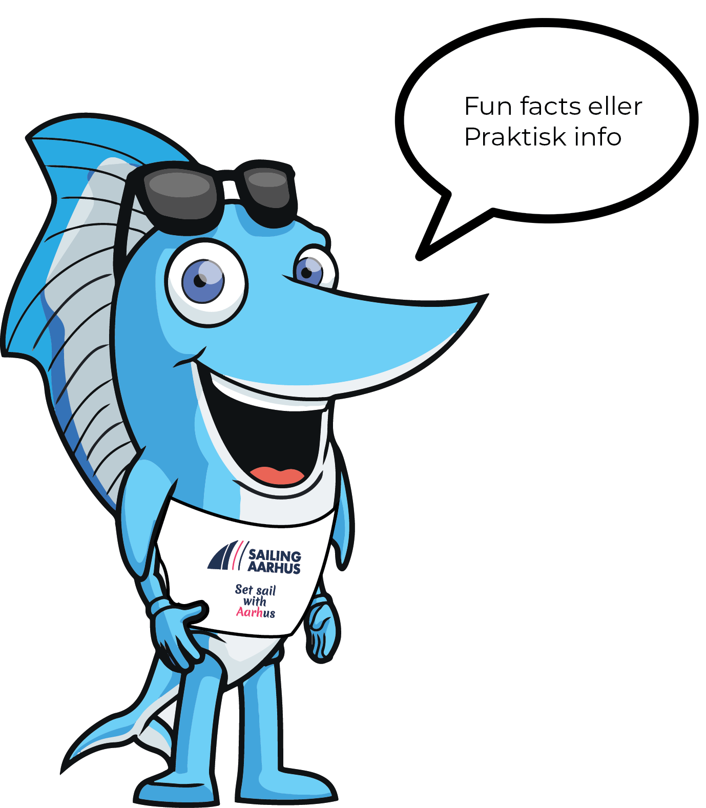
The importance of engaging with the community and sharing a passion for sail sport. The social media strategy is anchored in a friendly and informative mascot named Skipper, who’s here to make your sailing journey even more enjoyable.
We use Skipper to inform about upcoming events, from regattas and races to workshops and family-friendly sailing days.
